Final feedback on forums facelift ...

> 10 years ago
Reply
Register to post, see what you've read, and subscribe to topics.
paddymac
paddymac
WA
943 posts
WA, 943 posts
28 Sep 2012 2:29pm
Dawn Patrol said...

^Same happens of my phone. Galaxy S3.

If you turn off the 'fit webpage to screen' setting (or soimething along those lines) it fixes it. But then all other websites look worse.


Yep, same behaviour on Moto Razr. Just checked - "Advanced"->"Auto-fit pages" both "off" (perfect) and default "on" (squashed left).
Dawn Patrol
Dawn Patrol
WA
1991 posts
WA, 1991 posts
28 Sep 2012 3:40pm
Yeh I'm having the same thing as paddymac. Looks perfect with the auto-fit off. But all crammed on the left when it is on.

Are there any recommended internet apps for android. Will try one of those and see if it is different.

Edit: Just downloaded chrome and firefox for android. And they both work fine. They don't even seem to have that particular setting. And they seem to work faster than the default internet app that comes installed on the phone. Problem solved for me!
laurie
laurie
SA
3887 posts
SA, 3887 posts
28 Sep 2012 5:36pm
oky doky - looks like we'll need to get our hands on an S3 or Razr to sort this "feature" out..

Here's our collection so, not forgetting 4 brands of browser on both PC & Mac!


BulldogPup
BulldogPup
6657 posts
6657 posts
28 Sep 2012 4:08pm
^^^^
well you do have to check all products AND how good they work don't you ..... toyaholic you are Laurence
paddymac
paddymac
WA
943 posts
WA, 943 posts
28 Sep 2012 5:06pm
Laurie, I think the Razr uses the standard Android browser.

Chrome works fine.
Leroy13
Leroy13
VIC
1174 posts
VIC, 1174 posts
28 Sep 2012 9:09pm
Well done Laurie, bringing the format into the 21st century!!
GreenPat
GreenPat
QLD
4103 posts
QLD, 4103 posts
28 Sep 2012 10:57pm
Good to see thumbs are back on android, now I can give Eppo some greens to try balance the reds.

I've also found the squashy thing going on, and found that if you double tap the open space the posts unsquash. But yeah, about to download Firefox just now anyway....
elbeau
elbeau
WA
988 posts
WA, 988 posts
28 Sep 2012 9:07pm
In every organisation, company or group there is some simpleton that thinks that

change is a panacea.
GreenPat
GreenPat
QLD
4103 posts
QLD, 4103 posts
28 Sep 2012 11:07pm
100 times better!

edit: 'To last post' in a thread doesn't work in Firefox, and 'Last Post' from the index page doesn't work in either FF or the Android browser.

Still the awesome though.
GreenPat
GreenPat
QLD
4103 posts
QLD, 4103 posts
28 Sep 2012 11:47pm
Skipped Chrome, as I choose FF over Chrome on pc, but am now on via Opera Mobile, which not only comes with its own pseudo 'last post' button (skips straight to bottom of a page) but typing in landscape mode is the best of the three.

Whether change is good, bad, required or a panacea, it is inevitable. I, for one, am always keen to see what's around the next corner. If the software I use in my job hadn't changed since I started I would have had to have gotten a new job years ago.

So I'm going to stick with Opera for now, seems to be the best solution for my situation (stupid small screen - work issue phone )
Marty1970
Marty1970
154 posts
154 posts
29 Sep 2012 6:35am
Thanks Laurie, it looks good nice and fresh, but can you get green arrows more often!!! kidding of course, good work mate.
TristanF
TristanF
VIC
230 posts
VIC, 230 posts
29 Sep 2012 9:47am
Hey Laurie, looks good, only improvement I can see would be to reduce the size of the Author box so that the minimum entry height is smaller. With the shadow effect it reduces the number of entries I can see on the screen by 1/3.

There are lots of entries in forums of one or two lines, so this is going to make for lots more scrolling.

I'm looking at this on an iPad, so recognise that it may look better for a smartphone.
Paul Kelf
Paul Kelf
WA
678 posts
WA, 678 posts
29 Sep 2012 11:10am
The water in the background looks a little SHARKY to me
Paul Kelf
Paul Kelf
WA
678 posts
WA, 678 posts
29 Sep 2012 11:12am
That was quick, the water changed already
chrispychru
chrispychru
QLD
7932 posts
QLD, 7932 posts
29 Sep 2012 4:02pm
i still can not type any faster...im not fazed either way
Scotty88
Scotty88
4214 posts
4214 posts
29 Sep 2012 2:08pm
laurie said...

oky doky - looks like we'll need to get our hands on an S3 or Razr to sort this "feature" out..

Here's our collection so, not forgetting 4 brands of browser on both PC & Mac!


That's a sh1tload of phones Laurie.
Is Seabreeze a front for an industry much more lucrative ?
BulldogPup
BulldogPup
6657 posts
6657 posts
29 Sep 2012 2:12pm
Whats a lucrative
Hobie1463
Hobie1463
SA
449 posts
SA, 449 posts
29 Sep 2012 9:54pm
Hi,

Buy & sell,

When you update an existing advert. Can it be saved and moved back to the top of the list. This feature was available for a long time but now it has changed again. Wg
Hen you edit your advert it stays in the same place Whitch could be lots of pages down.

For those of us who regularly update our adverts this would help heaps.

Cheers
adolf
adolf
1862 posts
1862 posts
29 Sep 2012 10:03pm
What a fantastic improvement.

Now can we get rid of the yellow box at the top.

It makes me think I've got some nasty pm from someone that I don't want to read?
fin pop
fin pop
WA
14 posts
WA, 14 posts
30 Sep 2012 9:01pm
Looks real good!!
seanhogan
seanhogan
QLD
3424 posts
QLD, 3424 posts
1 Oct 2012 7:11pm
Hi laurie,

the green "new" doesn't disappear after topic has been read...
jev7337
jev7337
QLD
460 posts
QLD, 460 posts
1 Oct 2012 7:18pm
Hey Laurie,
I'm on a 30" screen with 2560x1600 resolution.

The background image is to small for that and the header/menu bar stops about 3/4 to the right of the screen.
Size does matter

Besides that, all good.
jev7337
jev7337
QLD
460 posts
QLD, 460 posts
1 Oct 2012 7:23pm
...and can you add some more green arrows for vico. Please.
laurie
laurie
SA
3887 posts
SA, 3887 posts
1 Oct 2012 7:47pm
When you update an existing advert. Can it be saved and moved back to the top of the list. This feature was available for a long time but now it has changed again.


We all want our advert to be at the top when it's listed, and yet it's fair that every new advert has it's time in the sun at the top of the list. Unfortunately, some folks would make it a daily ritual to 'bump' their advert to the top, thus ensuring that even newly listed adverts didn't get a fair showing, so the bump system was disabled. So, yes, with the new update, you can bump again, but there is a delay between how often you can do it to ensure everybody gets a fair go.

the green "new" doesn't disappear after topic has been read..


Yes, this will fox a few people I'm sure. To example: It uses your last 'session' as the 'new' indicator. Once you close your browser, and revisit, the 'new' topics are ones since your last session. Still confused? Me too, but just like riding a bike, using it a few days, it begins to makes sense.

I'm on a 30" screen with 2560x1600 resolution.


Wow .. what an awesome monitor that must be, and yes, sorry, you'll get square edges on the piccie for now... (but will address in future updates)

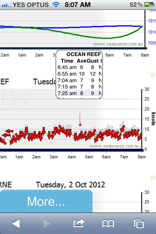
More green arrows for Vicco


Sorry, pre-allocated to WA's summer.

'To last post' in a thread doesn't work ...


All fixed!

..and also Apple iPhone layout stabilised even more ..


And, can I ask - does anybody have a Samsung Galaxy S3? If so, could I trouble you to try reading a forum, and see if it's now formats correctly (more stuff has been tweaked!) and post your findings here?
tightlines
tightlines
WA
3509 posts
WA, 3509 posts
1 Oct 2012 9:28pm
adolf said...
What a fantastic improvement.

Now can we get rid of the yellow box at the top.

It makes me think I've got some nasty pm from someone that I don't want to read?


ha ha yep I know what you mean, every time I open up seabreeze I think I have a pm.
kiteboy dave
kiteboy dave
QLD
6525 posts
QLD, 6525 posts
2 Oct 2012 7:35am
Looks good except my little opinion is that there's still too much white, it kinda hurts the eyes. Just the white clouds around the bottom of the water pics in normal view - why not just leave the water?
Sailhack
Sailhack
VIC
5000 posts
VIC, 5000 posts
2 Oct 2012 10:44am
Looks great on my Motorola now! Much easier to navigate & view.

A couple of (minor) criticisms;

Why not push the format a little more? Apart from font & colour changes (re; background ocean scenery & pastels) I haven't noticed a huge change on my pc - although I didn't have an issue with the old format. Just saying - if you're going to change something, do you change it a bit, or a lot...I guess the 'mother' drink is an example of not changing too much?

Also, when I right click to view the last topic in a thread that contains a pic (say funny images thread) I don't get the 'open in new tab' option, just the image options (W7 OS) - please fix as I like to start by opening a gazillion tabs & work my way through them over the course of the next few hours.
BPBPerth
BPBPerth
WA
17 posts
WA, 17 posts
2 Oct 2012 9:23am
Laurie - formatting on the iPhone needs some tweaking. See picture attached. Wind reading relevant to arrows are not correctly aligned and it does not display all content.
IE9 - holding cursor over arrow does not display wind readings, may only be my browser as it works on Firefox browser.

jev7337
jev7337
QLD
460 posts
QLD, 460 posts
2 Oct 2012 2:34pm
Hey Laurie, there is a small problem with the search function in the Buy&Sell section.

Search Criteria
Category: Kitesurfing - Boards
Make: Slingshot (or any other make)

Result
No Items Found

TurtleHunter
TurtleHunter
WA
1675 posts
WA, 1675 posts
2 Oct 2012 1:20pm
jev7337 said...
...and can you add some more green arrows for vico. Please.


Thanks for the green arrows Laurie
Please Register, or first...
Topics Subscribe Reply

Return To Classic site 😭
Or... let us know if a problem, so we can tweak! 😅